¶ Interface Panel Files (.ypn)
The Smart Pendant allows custom 'Interface Panels' to be created via an easy-to-use drag & drop editor, allowing custom a UI/HMI taylored to production applications.
These Interface Panels can also be exported and imported to/from JSON-like text files (.ypn) for hand editing with a text editor and either distributed as-is or included in Install Package files for automated installation with along other artifacts.
The Interface Panel file .ypn format is described below.
¶ Example
The .ypn files define a single panel. Here is an example:
{ // Yaskawa Smart Pendant Interface Panel
format_version: 1
panelid: com.mycompany.mydept.panel2
version: 1.0.0
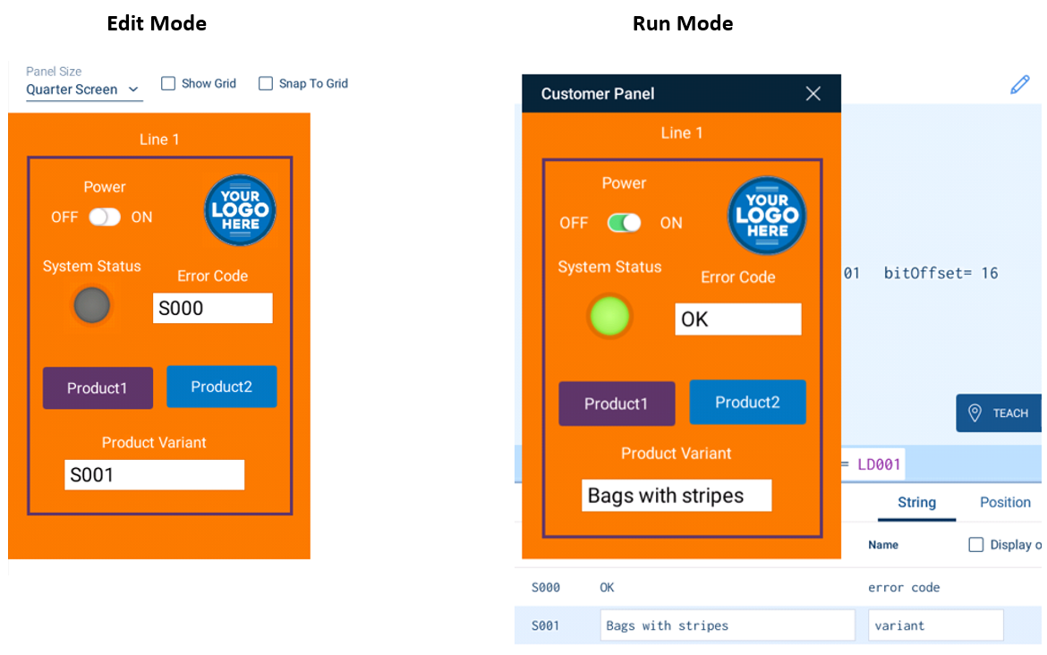
name: Customer Panel
lang: en
favorite: true
bg_color: "#f57900"
screen_size: quarter
controls: [
{
type: button
button_type: input
x: 44
y: 335
z: 1
width: 150
height: 60
color: "#5c3566"
expression: B000=1
label: Product1
label_size: 20
label_pos: center
}
{
type: button
button_type: input
x: 208
y: 333
z: 1
width: 150
height: 60
color: "#0277bd"
expression: B000=2
label: Product2
label_size: 20
label_pos: center
}
{
type: switch
x: 53
y: 113
z: 1
width: 150
height: 50
color: "#0277bd"
expression: I002=5
label: Power
label_size: 20
}
{
type: light
x: 91
y: 235
z: 1
width: 60
height: 60
color: "#8ae234"
expression: B000
label: System Status
label_size: 20
}
{
type: display
display_type: edit
x: 191
y: 238
z: 1
width: 160
height: 60
color: black
expression: S000
label: Error Code
label_size: 20
}
{
type: frame
x: 23
y: 55
z: 0
width: 356
height: 481
color: "#5c3566"
label: Line 1
label_size: 20
border_width: 4
}
{
type: image
x: 255
y: 77
z: 0
width: 104
height: 104
color: transparent
expression: B000
image: data:image/png;base64,iVBORw....rkJggg==
}
{
type: display
display_type: edit
x: 74
y: 459
z: 1
width: 240
height: 60
color: black
expression: S001
label: Product Variant
label_size: 20
}
]
}
¶ Reference
The files are HJSON, which is very similar to JSON with some improvement for human concenienve, such as comments, optional quotation around strings when not necessary and others.
¶ Panel
The panel itself is an object, so the whole file is contained within { and }, which in turn contains a set of object keys and values in the form key : value on each line. The file is assumed to be UTF-8 encoded Unicode.
The top-level panel properties are:
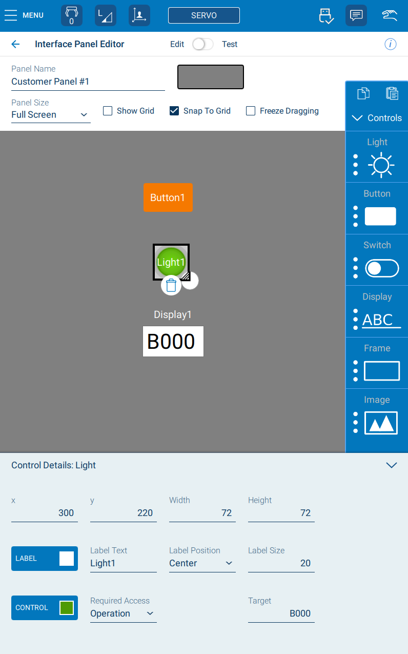
format_version(optional, default 1) - currently must be 1. This is to support future enhancements to the format.panelid(required) - Every panel should be identified by a unique id used by the software. This should take the form of a 'reversed domain name' (like Java package names). For example, if your company has a domain www.mydept.mycompany.com you might use idcom.mycompany.mydept.panel1. Like a domain name, no spaces are allowed and the set of valid characters is restricted. When a panel is created in the pendant editor and exported, an id will be created based on the panel name.version(required) - A version for this panel defined in the file. When panel files are included in an install package (.yipfile) for installation, the installer will skip them if the same panel is already installed, bypanelidandversion. So, when updating your panel, be sure to increment the version. For example, "1.0.0", "1.1.0", "1.2.34", "1.2.35".name(required) - A human readable name for the panel which will be displayed on the pendant Panels List. For example, "Operator Paint Controls".lang(optional, defaulten) - the IETF/ISO two-letter language code for the natural language of this panel. May also optionally include a region code. For example, "ja", "de", "es", "zh-CN".vendor(optional) - the name of the vendor or company authoring the panel.favorite(optional, default false) - iftruethen the panel will be shown in the pendant main menu for quick accessautorun(optional, default false) - iftrue, the panel will be opened after the pendant completes startup when powered on.restrictedInterface(optional, default fase) - iftrue, then the pendant will show a restricted interface when the panel is run, hiding many main menu options to provide a minimal interface to the operatorlast_edit(optional) - the last edit time. Updated by the pendant editor (YYY-MM-DD HH:MM:SS)tag(optional) - a useful author custom tag stringcomment(optional) - a human interpretable comment for the author or user (not shown on the pendant UI)bg_color(optional, default white) - the background color of the whole panel. Use HTML-style 6-digit hex values or common color names. For example, "#FF0000" (red), "#00FF00" (green), "#0000FF" (blue), "#808080" (mid grey)screen_size(optional, defaultfull) - The size of the panel. One offull,halforquartercontrols(required, list) - a list (enclosed in[and]of individual controls of the panel. The properties for each control are defaulted below.
¶ Controls
type(required) - one oflight,button,display,image,switch,job,comboBox,frame. This determines the kind of control and which properties are applicable.
Many control types share these properties in common:
x(required) - the X coordinate on the panel (0=panel left edge, 800=right full-width panel edge)y(required) - the Y coorcinate on the panel (0=panel top, 1200=bottom full-height panel edge)z(optional, default 1) - the layer ordering. Higher z values are 'on top of' lower valueswidth(optional, default 100) - the width of the control horizontally, if adjustableheight(optional, default 200) - the height of the control vertically, if adjustablecolor(optional, default black) - the color of the control itself, if adjustableexpression(optional) - an expression dictating what the control controls or ddisplayed (described below)label(optional, default none) - the label text displayed next to the control (adjustable vialabel_posandlabel_size)label_color(optional, default white) - the color of the label textlabel_pos(optional, defaulttop) - one oftop,bottom,leftorright. Determines the placement of the control's label text relative to the controllabel_size(optional, default 200) - the size of the label text font (in pixels)required_access(optional, defaultoperation) - one ofoperation,edit,management,safetyorsupport
Each type of control may also have type-specific properties:
¶ Button
button_type(optional, default input) - one ofinput(Set Value),panel(Open a Panel),toggleormomentary.
Aninputbutton will set its target (e.g. I/O or variable) to the specified value when clicked (and have no action upon release). Atogglebutton will alternate the target between on and off values every time it is clicked. Apanelbutton type will open another Inteface Panel (specified) when clicked. Amomentarybutton will set the target to the on value when pressed and return it to the off value when released.
¶ Light
A light is an indicator that can show the status of its target. It has no type-specific properties - being fully specified through the common properties above.
¶ Display
A text display.
display_type(optional, default output) - one oftext,output,input,edit
Whentextit will just display the static text of the expression property. Ifoutput, the text will show the value of the target (e.g. numeric or string variable). Wheninputthe text field will only set the target value to the user entered text when run, but will read back the target value and display it. Finally,editwill do both - it will show the target's value, but also allow entry and will set the target based on the user input.
¶ Image
image(required) - For importing, this can be a filename of an image file in the same folder as the.ypnfile (.png,.jpgor.svg). It can also be an inline data URI with base64 encoded image data (e.g. starting withdata:image/jpg;base64,and followed by the Base64 encoded JPeg data). On export, images are always output as data URIs within the .ypn file.
Here is an online image Base64 URI encoder: https://base64.guru/converter/encode/imageimage_lock_aspect(optional, default true) - if true, keep the original image file's aspect ratio
¶ Switch
switch_on(optional, default "ON") - the text to show for the On position of the switch (if any)switch_off(optional, default "OFF") - the text to show for the Off position of the switch (if any)
¶ ComboBox
combo_box_type(optional, defaultjobs) - currently the only type.
¶ Frame
border_width(optional, default 4) - the pixel thickness of the frame border
¶ Job
job_action(optional, defaulttop) - which action to take when the button is pressed. One oftop,run,stoporpause.job_target(optional, defaultcurrent) - which job is the target of the button - the current job or the master/default job. One ofcurrentormaster.
¶ Expressions
The expression property used by many controls determines the target (e.g. a specific variable or an I/O and in some cases may include values).
In the context of reading a target (e.g. a light control) the expressions may be a variable type and index, such as B001, I003, D123, R876 or, where text can be displayed (such as a Display control), a string variable reference like S100.
I/O values are referenced via the prefix IN# for inputs, OT# for outputs, IG# for an input group (byte) and OG# for an output group/byte. For example OT#5 is logical output 5 (like INFORM DOUT 5).
It is also possible to reference General I/O via # (or G# for groups) and registers via the M prefix.
If in doubt about the syntax of an expression, create a panel & control using the graphical editor on the pendant and export it, then check the expression in the resulting
.ypnfile.